Find Jobs - We are Here for You
Description
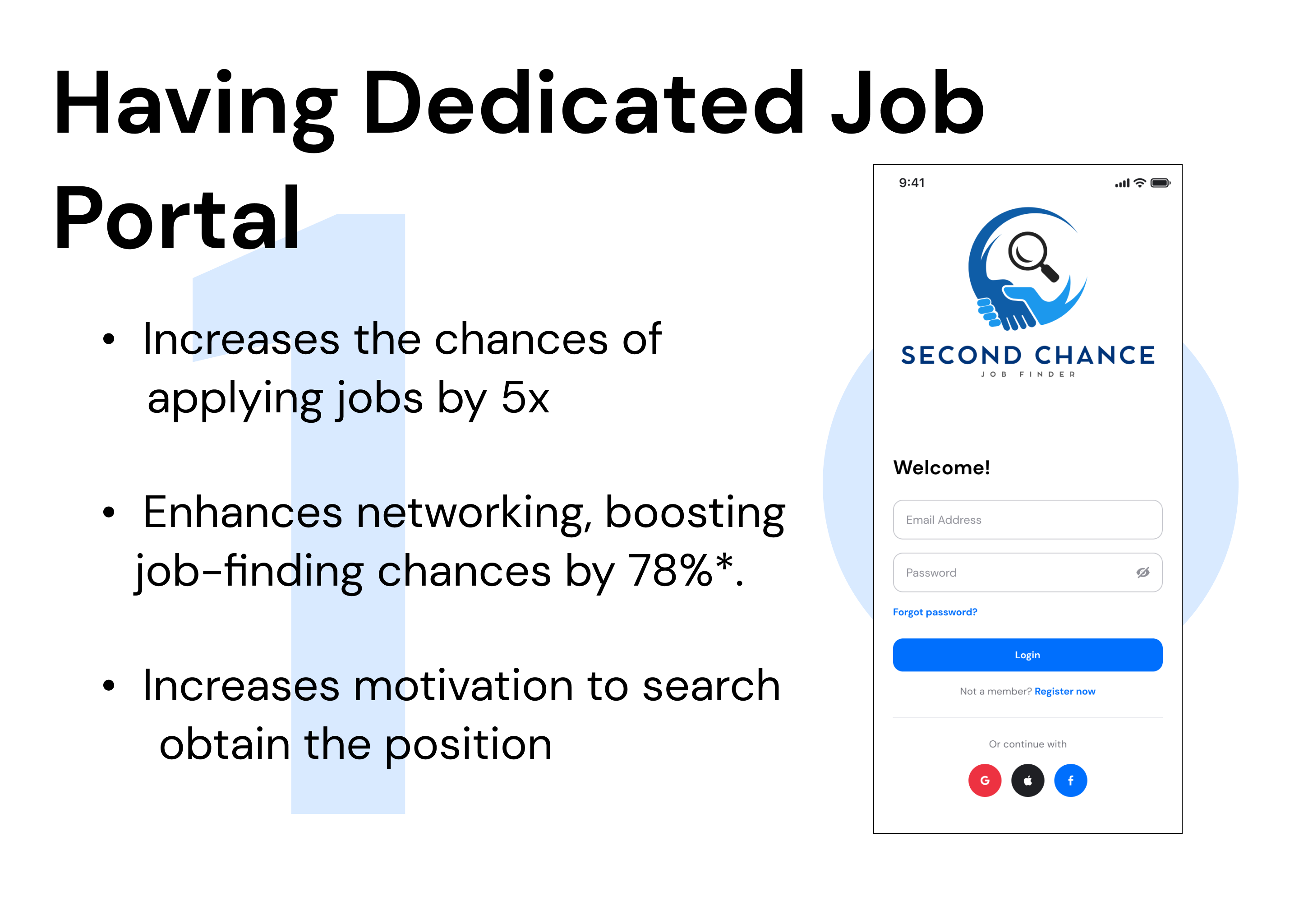
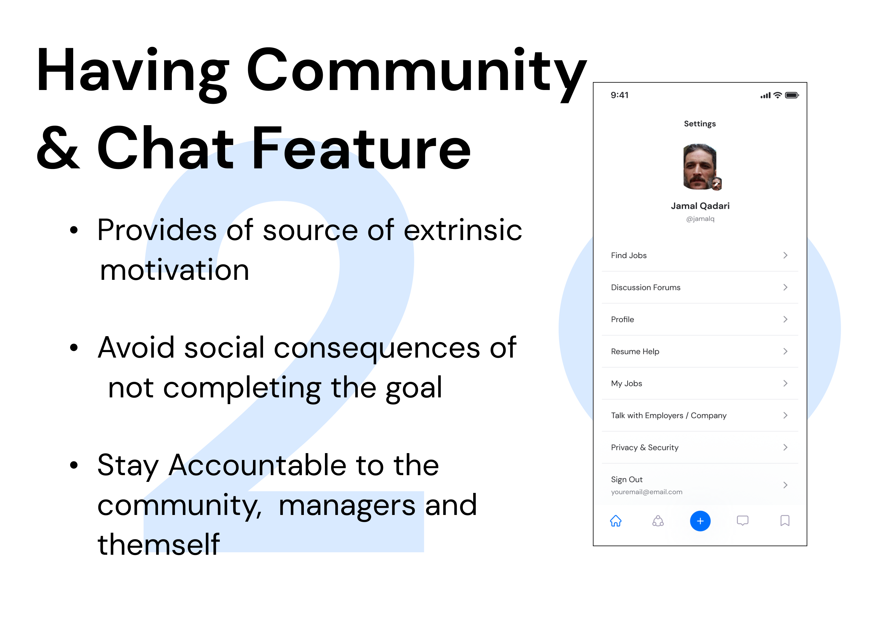
Second Chance - Job Finder is a mobile-based application targeting formerly incarcerated individuals to find jobs, chat with employers, and engage with the community.
Role: Product Designer / No-Code
Team Size: 1
Platform: Mobile Application
Tool Stack: Figma / Adobe XD / Microsoft PowerPoint / Adobe Illustration
Duration: August 2022 - February 2023
Link: Click Here
Goal
The goal of the app is to target only formerly incarcerated individuals and ease the process of finding and applying for jobs.
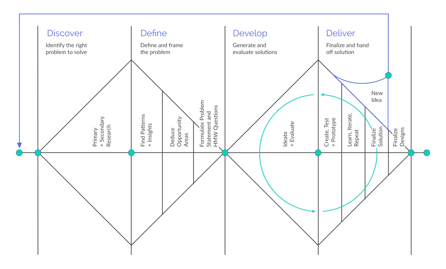
The design process I followed for this project is explained by the figure.

Solution


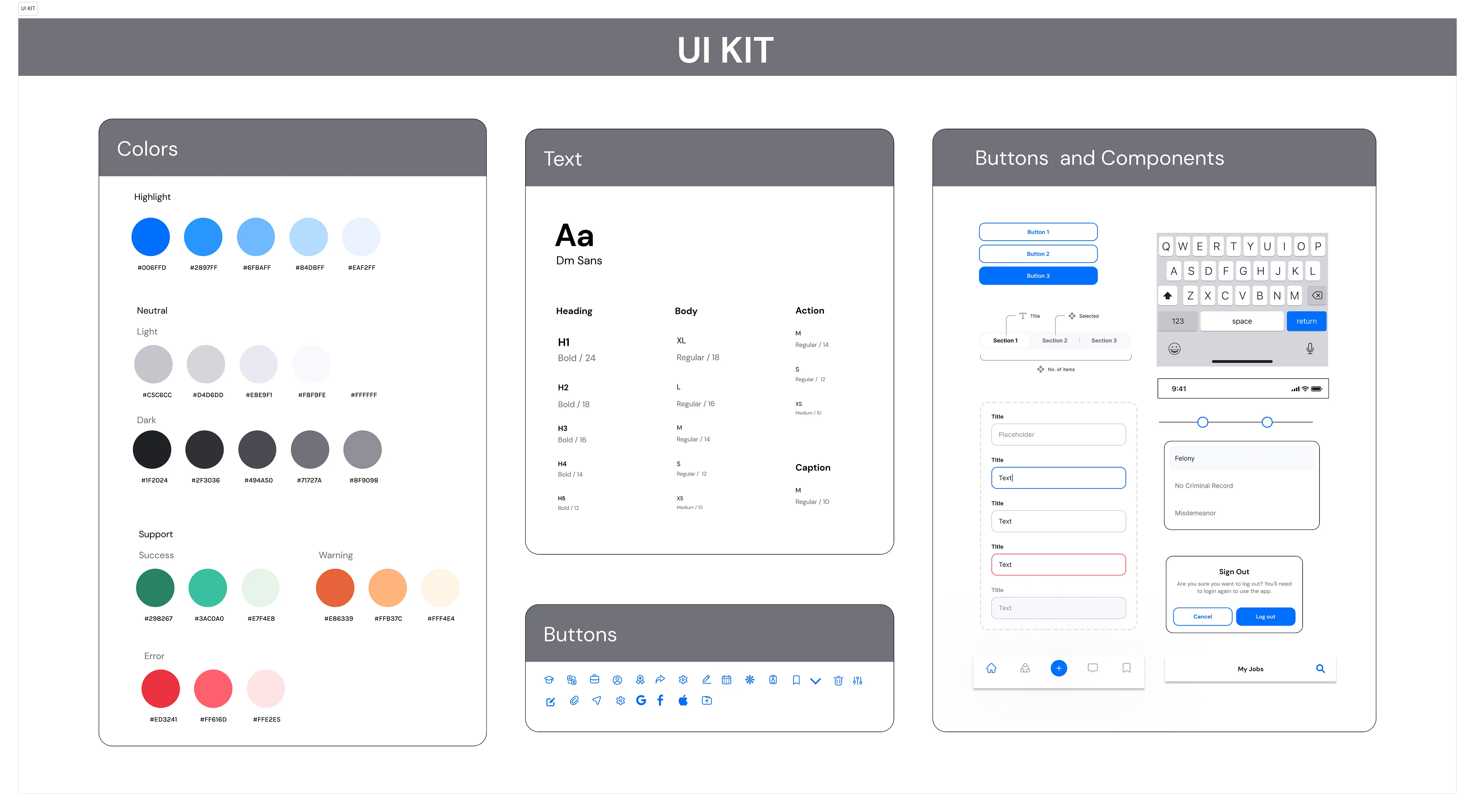
UI KIT / STYLE GUIDES
What kind of feeling do I want ex-inmates to experience while using Find Jobs? I aim for ex-inmates to feel inspired and stable, symbolized by the color blue. The combination of blue and white also represents purity. Blue is the primary color in the application, supported by a few other shades. I used sans font for better legibility and to create a friendly and inviting environment.

Deliver / Reflection
What Next?
I have a huge list of features to add to the application and I want to work on that!
- Incorporate an application status feature for ex-inmates, allowing them to monitor the progress of their application.
- Integrate a feature for scheduling virtual interviews within the app for ex-inmates.
- Implement a skill test to identify the specific skills of ex-inmates and suggest jobs accordingly.
- Create a dashboard for employers to view the number of applications received via the application.
- Include a blog section where successful ex-inmates can share their journey through inspiring articles.
- Better adhere to WACG standards.
Major Learning
Through regular usability testing, I gained crucial insight into how to translate user data and feedback into tangible designs that align with UX Design principles. By designing and building what the community needs, I gained a deeper understanding of designing within the constraints of feasibility and effort.
There is a huge list of learning, I subconsciously thought of what the final design would be even before I started, however, after the research and defining phase, that completely changed. Saying so I would like to add the top 4 learnings:
- Heuristic Evaluation and moderated usability testing helped me to understand what end users will feel when they use the app.
- I learned how to think intentionally about every element of the project and how it can contribute to the result.
- I gained a deeper understanding of designing within the constraints of feasibility and effort.
- Problem that is defined correctly, almost contains the final solution.
Visit Final Prototype here.