Nepali Things LLC
Project Brief
Nepali Things is a web-based event listing and ticketing platform targeting the Nepali Community in the United States.
Role: Product Designer / No-Code
Team Size: 4
Platform: Web
Tool Stack: Figma, Next.js / TypeScript / Node.js / Chakra UI / MongoDB / Express.js
Started: October 2021
Link: Click Here
Background
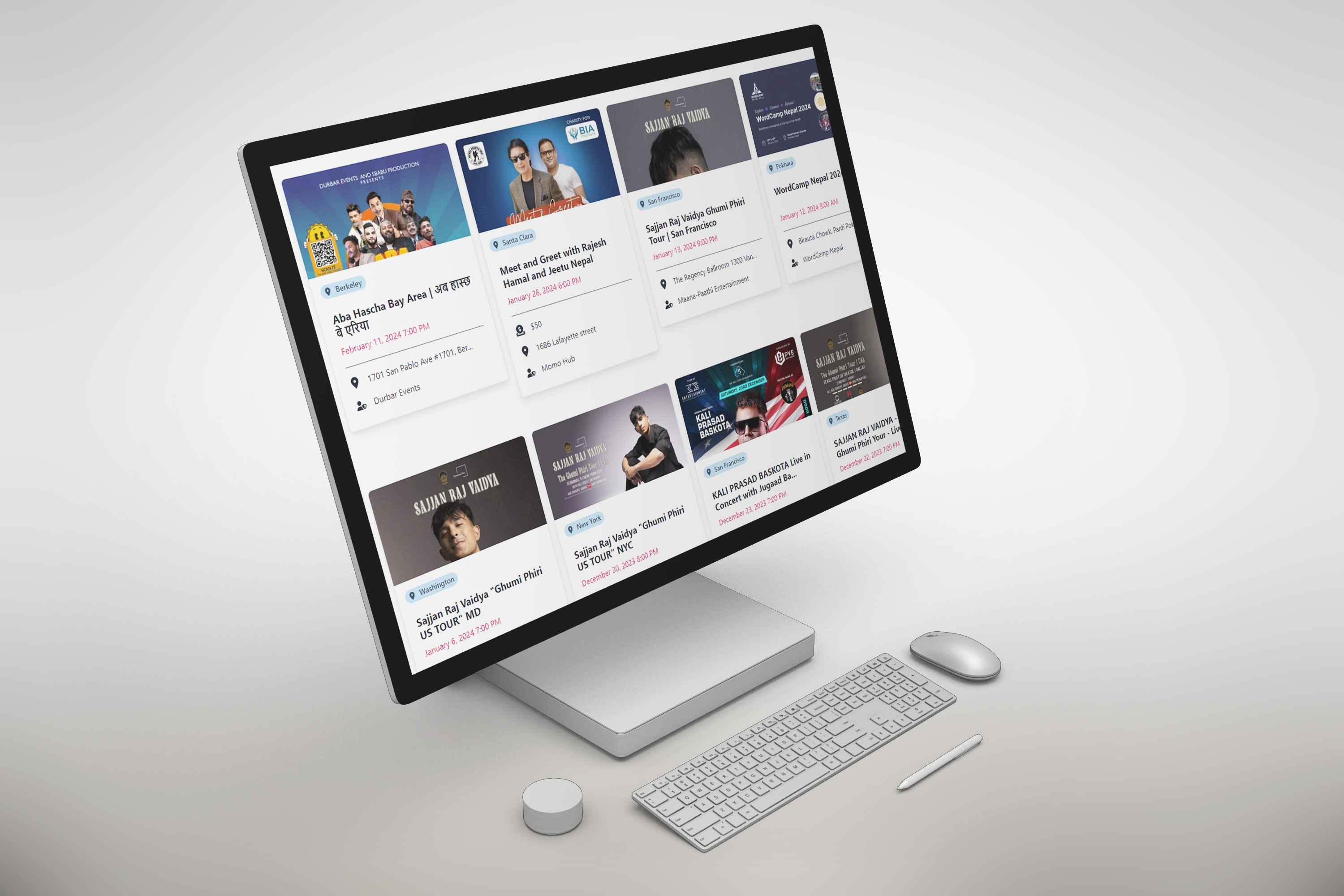
This platform aims to enhance the visibility and accessibility of Nepali Events, catering to the growing Nepali community in the United States. The main goal of this platform is to streamline the event ticketing process, addressing the lack of a centralized system for listing and managing events.
Role:
As a Product designer and Co-founder at Nepali Things LLC, my role encompassed
conducting user research, translating concepts into user flows, analyzing data, designing
wireframes and prototypes, and validating design decisions through usability testing.
Contextual Interviews
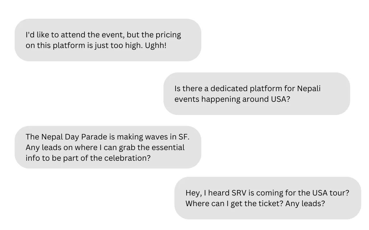
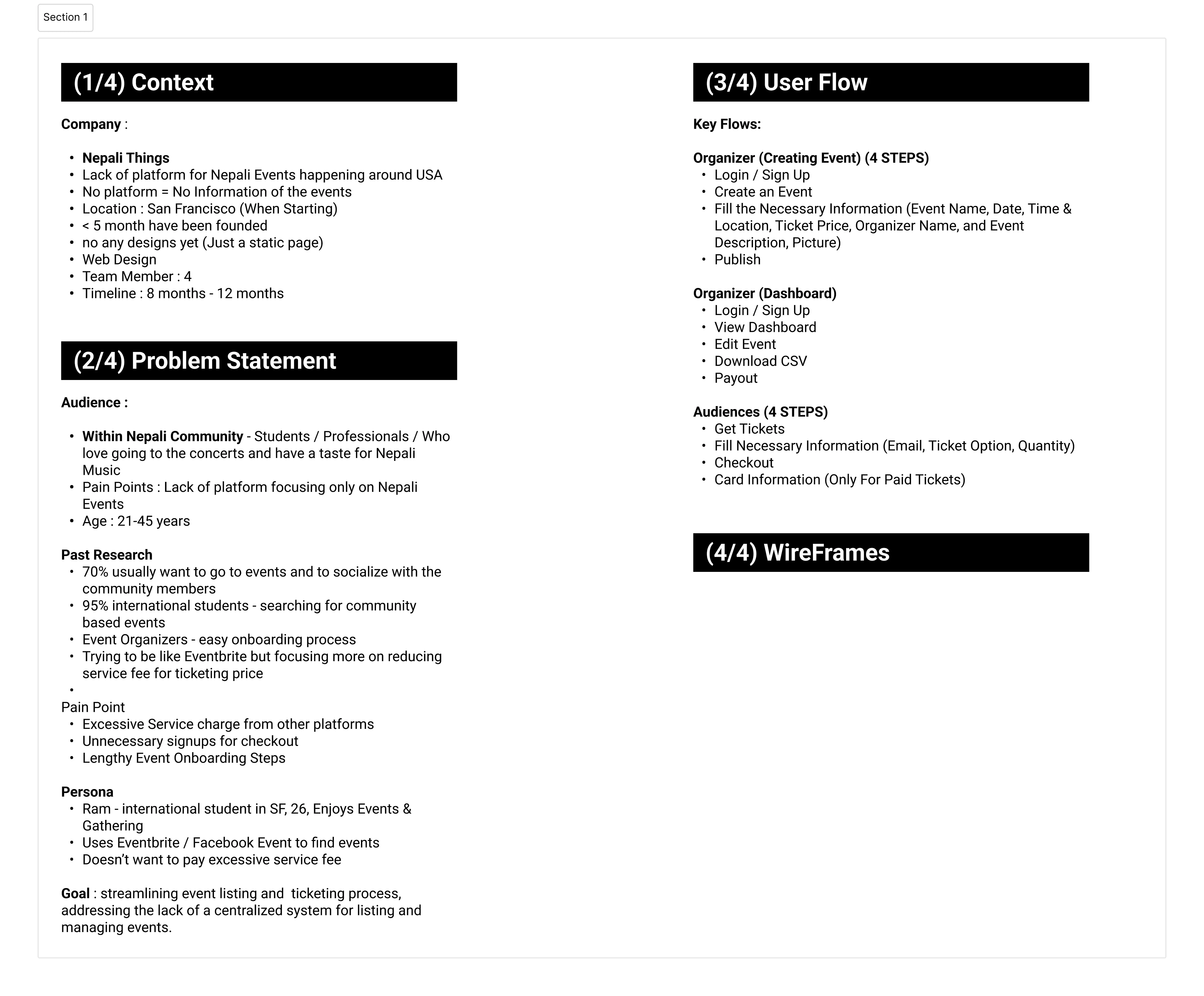
I started with qualitative research, developed some hypotheses, created user personas, and started by asking a few initial questions.
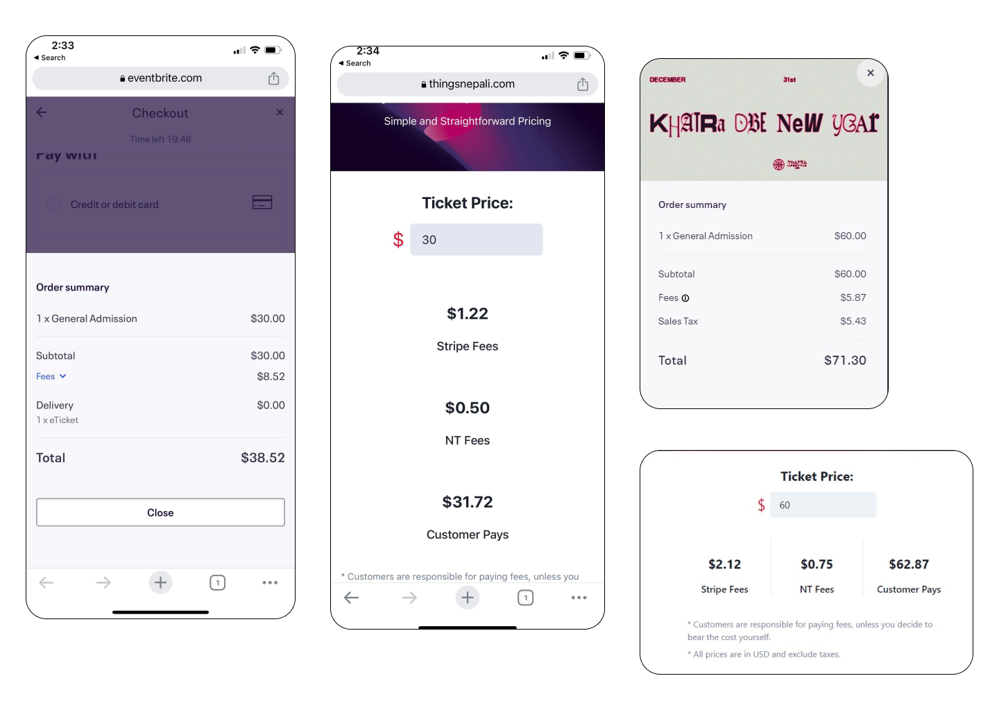
Interview findings revealed significant frustration among Event Organizers and Attendees due to the lack of a Nepali event listing platform and excessive charges from other platforms while purchasing tickets. The contextual interview provided valuable insights into user pain points to address designing a new, more usable, intuitive, easy navigation system and accessible event and ticketing listing website.
Competitor Analysis
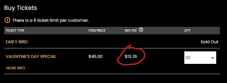
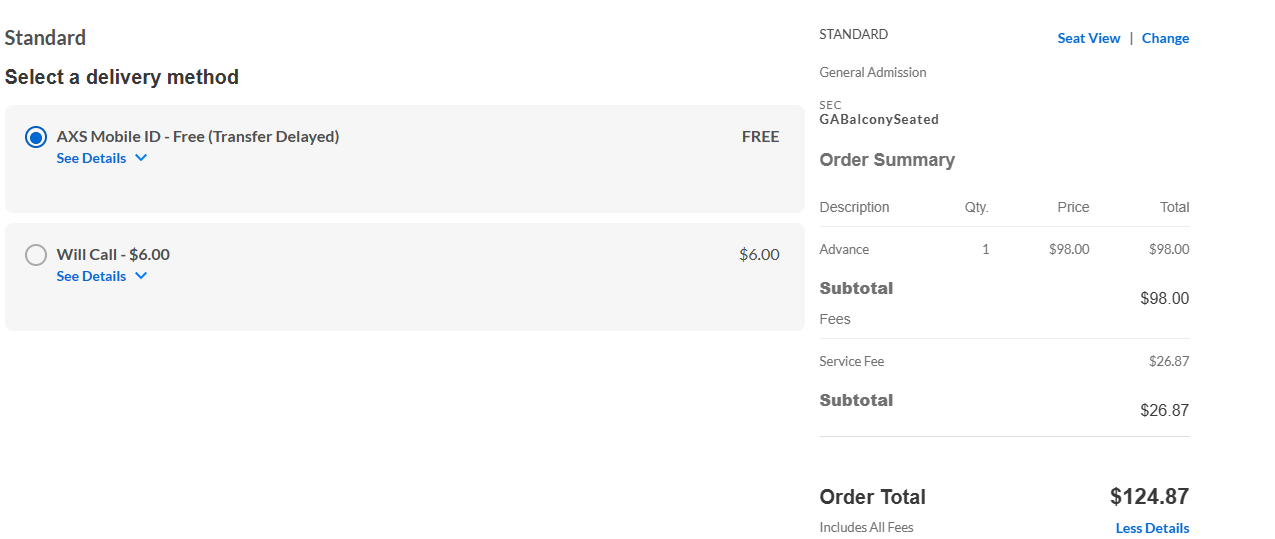
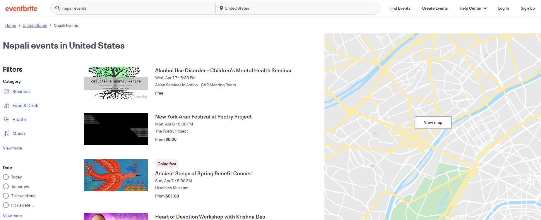
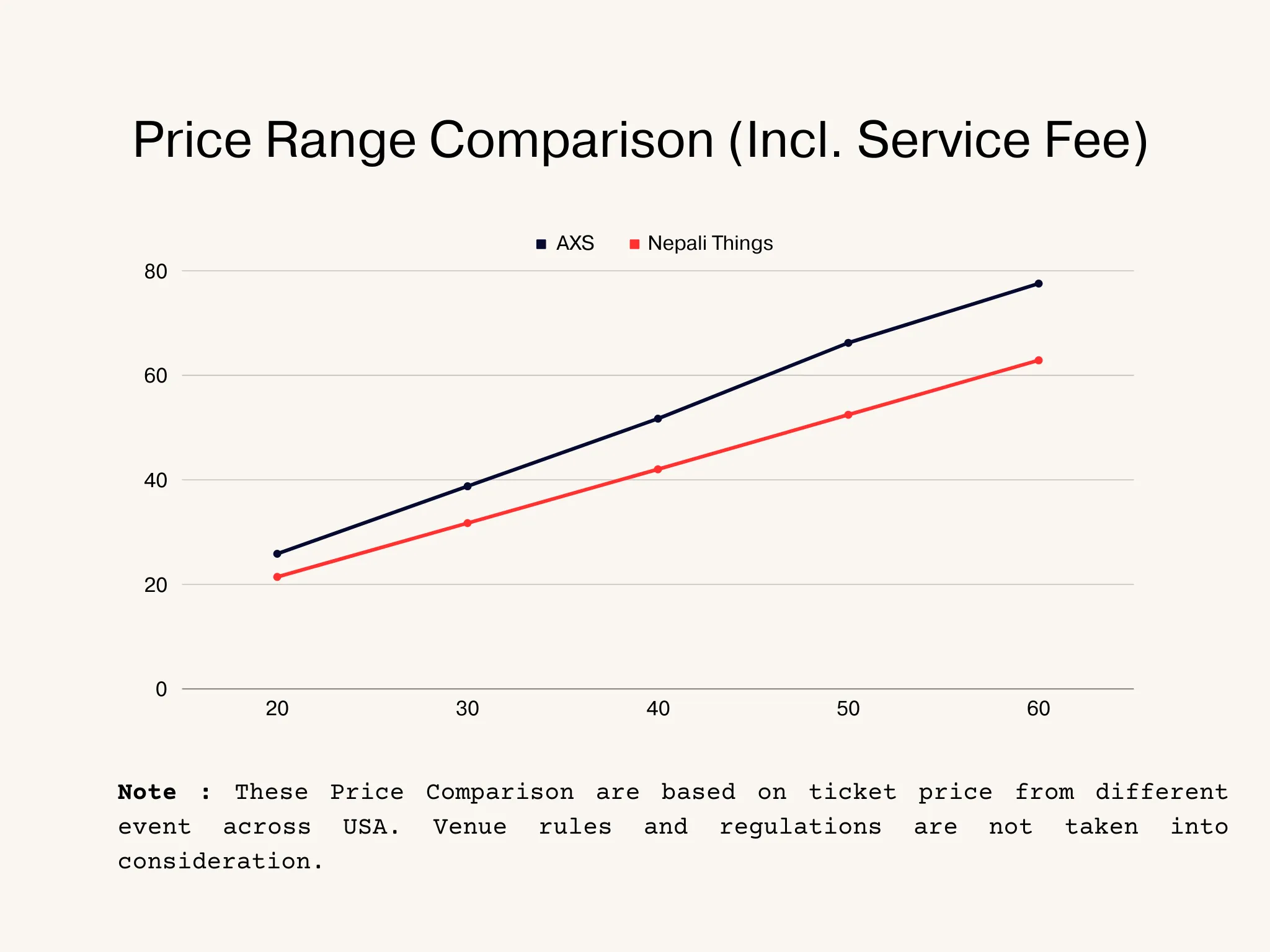
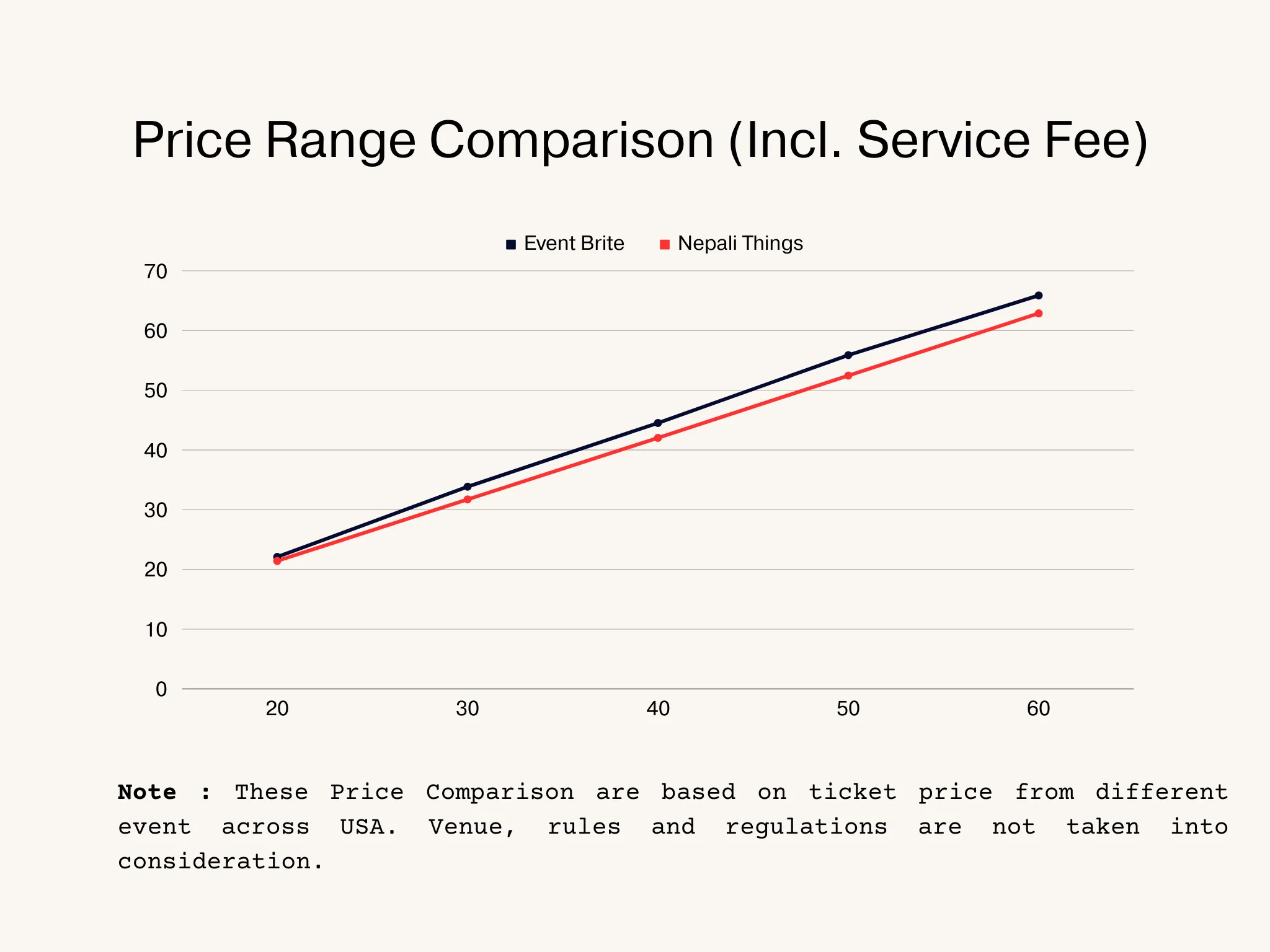
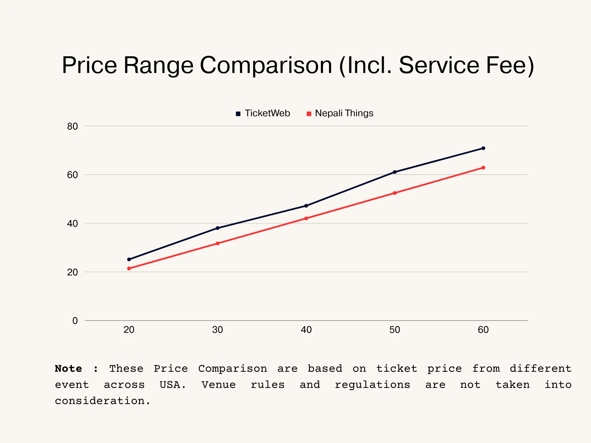
I examined major ticketing platforms like Eventbrite, AXS, Ticketmaster, and Live Nation to understand the issues faced by both organizers and attendees. Some notable findings include high service fees, unnecessary sign-ups during ticket checkout, and a lengthy process for event onboarding.
User Journey Map and Affinity Diagram
Following a comprehensive analysis, I initiated the development of a future state user journey map and affinity diagram. The objective is to facilitate event organizers in seamlessly creating events and enable end users to effortlessly purchase tickets within a three-click process. The process involved crafting user flow diagrams, user stories, flowcharts, and storyboards that centered around customer touchpoints, incorporating user actions and responses at each stage of the journey.
Emphasis was placed on ensuring an optimal overall user experience, aligning with both the organizers and end-users to create an exceptional customer journey map and affinity diagram.
Designing the MVP
User Research Summary
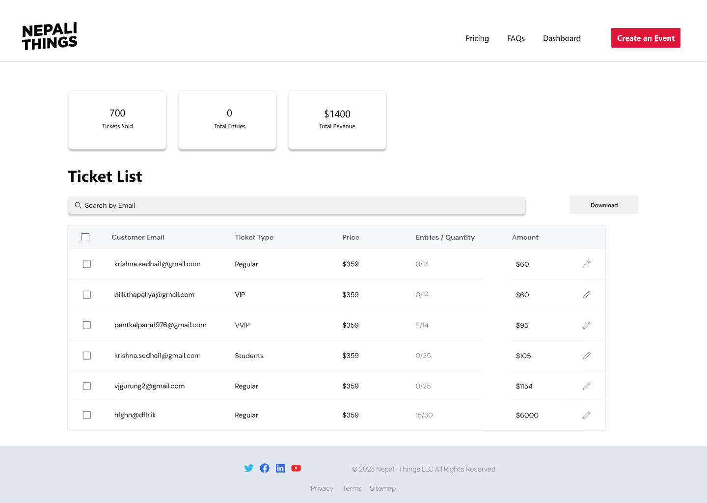
Conversations with Nepali Event Coordinators, attendees, and artist management firms indicated a strong desire among users for a unified platform showcasing all Nepali events across the USA. Additionally, users expressed a preference for concise event details, specifically Event Name, Date and Location, Ticket Price, Organizer Name, and Event Description.
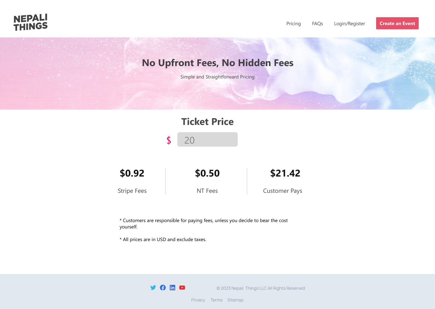
Moreover, the end-users emphasized the importance of a
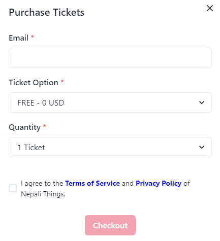
Usability Studies and Findings
After finalizing high-fidelity prototypes, usability studies were conducted with two separate groups (10 event organizers and 30 event participants). These findings allowed me to gather direct comparative feedback on the extent to which their previously identified needs and pain points were addressed in the new design. The goal of this was to identify areas for refinement and optimization based on user testing and feedback.
Key findings were:
- The organizer wanted a feature to list free events (community-based events) to know the number of participants with the same three-click process.
- Both the organizer and the audience desired the city to be prominently highlighted on the event card, to prevent confusion with similar events occurring throughout the state.
- Organizers desired a feature to list the event in the listing, even when utilizing a third-party ticketing platform, due to venue limitations.
Key Changes after Usability Studies Finding
The key findings were put into practice between October 2022 and October 2023.
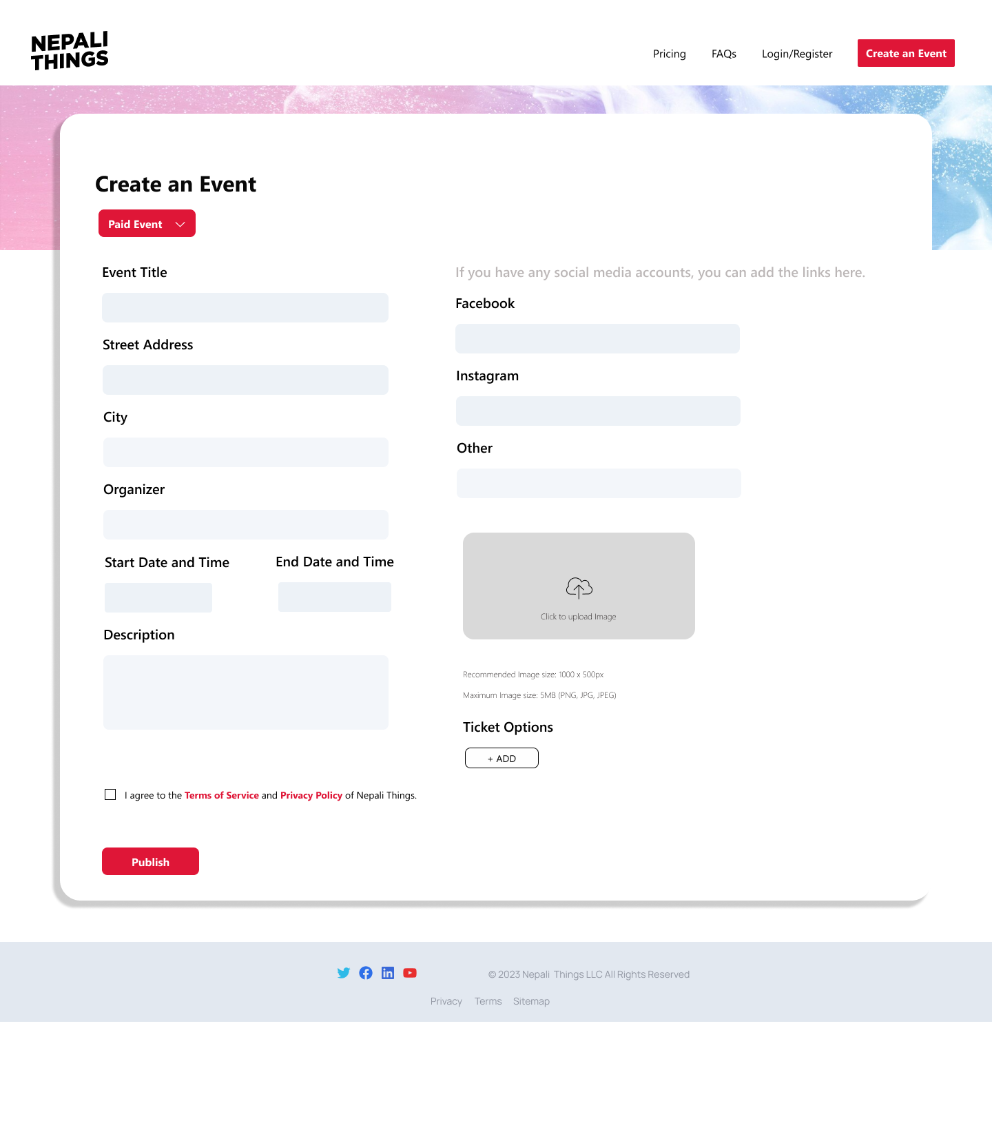
- To enable adding Free Events, a toggle button (Paid / Free Event) was introduced, adjusting the input form with backend logic.
- To enhance location clarity, the Event Location input form now comprises separate sections for Street Address and City, with the City prominently displayed on the event card.
- To prevent scams, a "Request Event" button was implemented. Organizers can submit event details and third-party links, subject to admin verification before going live.
Results and Learning
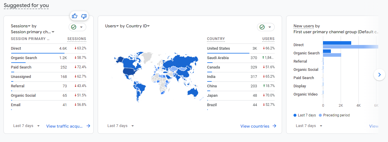
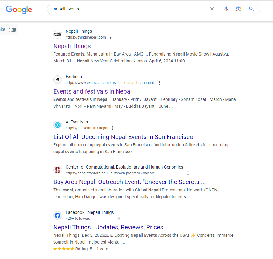
- Achieved a 45% increase in client retention and a 75% boost in website visits, showcasing the positive impact on user satisfaction.
- Learned to translate data, feedback, and insights into tangible designs, aligning with UX Design Principles.
- Heuristic Analysis and minimal designs are the key factors for achieving greater customer satisfaction.
Major Learning
Through regular usability testing, I gained crucial insight into how to translate user data and feedback into tangible designs that align with UX Design principles. By designing and building what the community needs, I gained a deeper understanding of designing within the constraints of feasibility and effort.
Visit Nepali Things here.