Case Study: Website Design for an Event Management Company
Overview
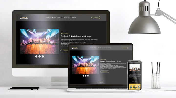
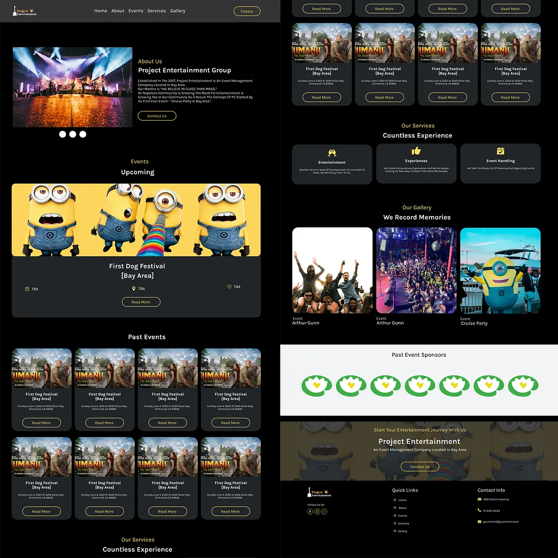
Hello everyone, I present a UI/UX design for an event management company based in California, featuring a simple and minimalistic approach. The company aims to develop a platform for archiving all previous events and streamlining event details. Their primary focus is on delivering exceptional customer experiences, both pre and post-events. For event details and ticketing before events, and for preserving event memories and pictures after events.

Role: UX and UI Designer
Team Size: 1
Platform: Web
Tool Stack: HTML / CSS / JavaScript
Project Duration 6 months
Link: Click Here
Discovery
The company Project Entertainment LLC required a complete website transformation since their old website lacked mobile usability, a crucial factor in today’s competitive world. Apart from optimizing for mobile, the website required significant improvements to enhance user experience. I actively engaged with the stakeholders of the company, conducted a comprehensive site audit, and established multiple goals for the redesign. Two main objectives were identified for the new website: increasing engagement during events and providing a compelling reason for visitors to return, ultimately boosting the number of site visitors.
UX Strategy
Once we defined all the goals, we initiated the phase for UI/UX design and strategy actively. To enhance engagement during events on their sites, I opted to incorporate interactive features that engage, educate, and assist visitors in finding their required information.
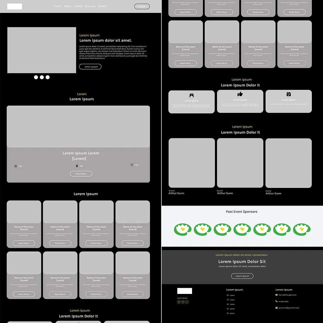
Deliberately, I planned the entire user journey to ensure a consistent narrative when users navigate between different sections of the site. Using wireframes as “blueprints,” I could efficiently review and adjust the plan to enhance the user experience.

Build
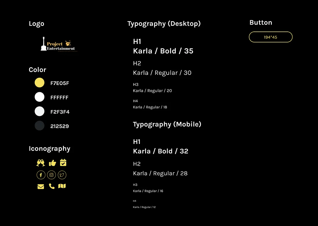
I finished low-fidelity wireframes and Sticker sheets, then redesigned the brand identity. I collaborated with team members and past customers to create new brand assets and personality for Project Entertainment.
The site uses the latest responsive technology for cohesive and fluid experiences across all devices.

User Testing
Once we successfully integrated all the material into the prototype, testing commenced. We thoroughly tested every feature on a fully responsive interactive site to ensure proper functionality and brand alignment.
Emphasis was placed on ensuring an optimal overall user experience, aligning with both the organizers and end-users to create an exceptional customer journey map and affinity diagram.
Results and Learning
- Achieved a 35% increase in client retention and a 25% boost in website visits in first 6 months, showcasing the positive impact on user satisfaction.
- Heuristic Analysis, Understanding the need of client plus user and incorporating minimal designs are the key factors for achieving greater customer satisfaction.
Major Learning
Here is one way to rewrite the text: Competitive analysis and A/B testing are integral to redesigning a website and its components. Asking thoughtful, open-ended questions allows us to collect comprehensive, precise data that informs the redesign process. This data-driven approach enables us to optimize the website for its target users.
Visit Project Entertainment LLC here.
